


Table of contents
Overview
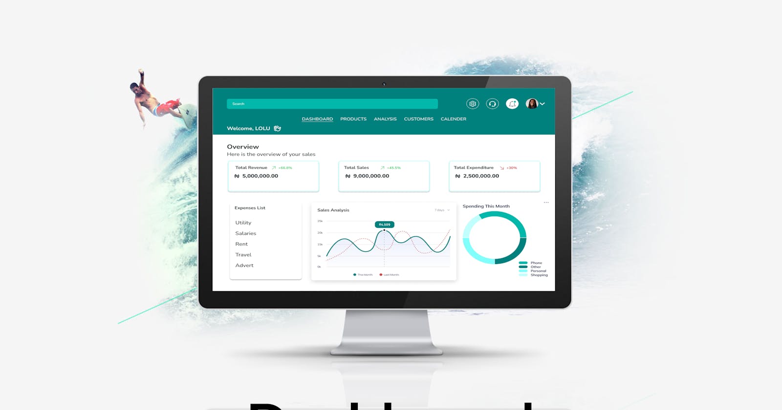
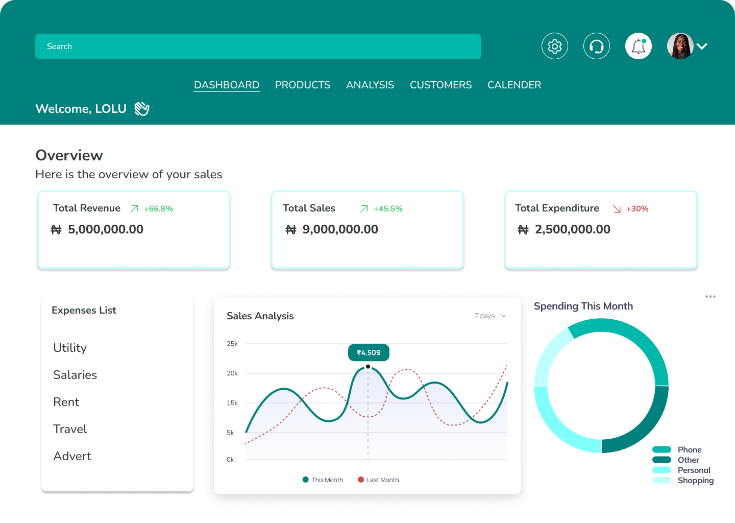
I noticed most dashboard designs have the same layout for the nav bar; they all have their nav bar on the left. So I woke up this morning thinking, "Why can't it be on the top?"
This made me use the early hours of today to design a new layout nav bar for a sales dashboard.
Process
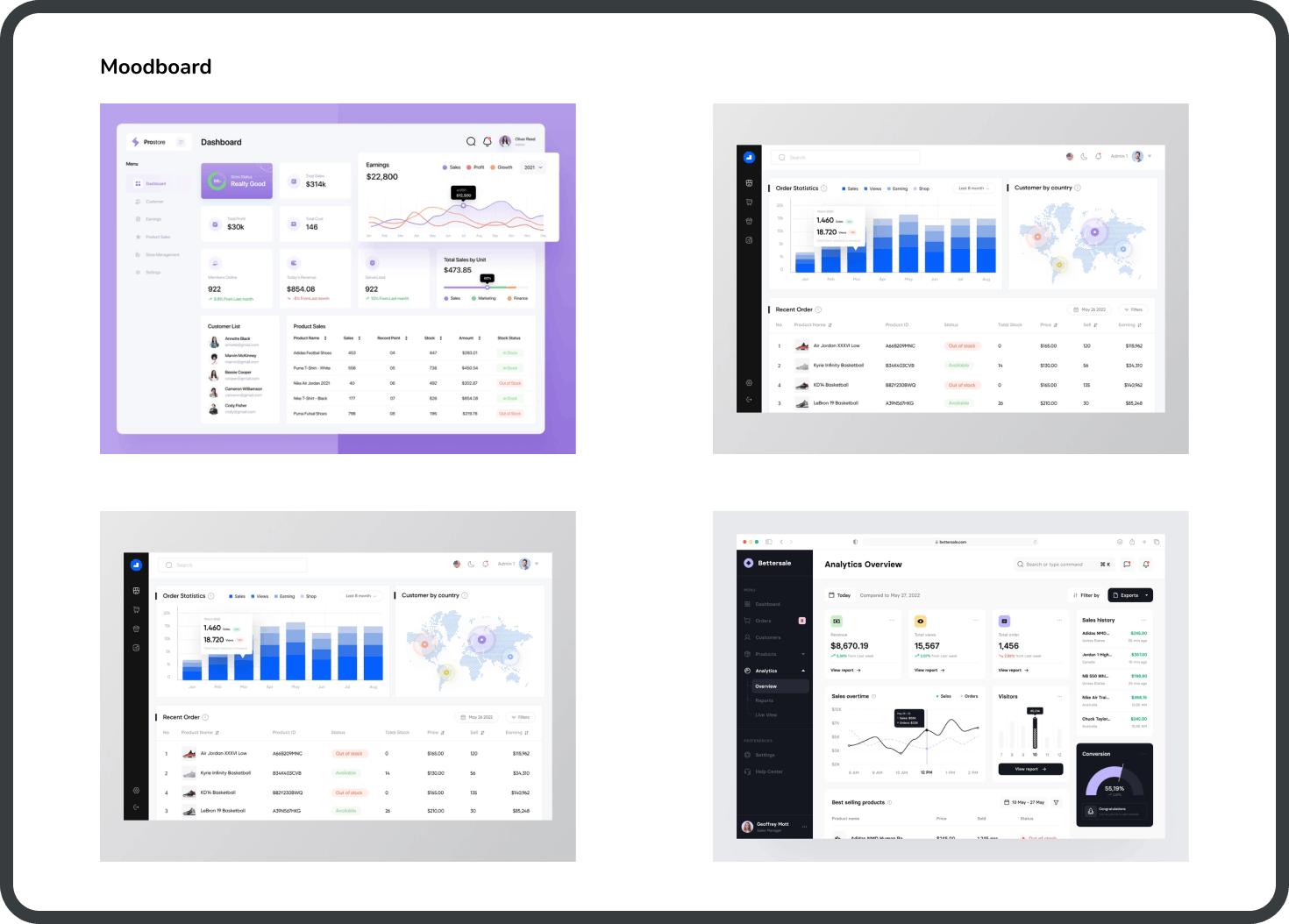
Moodboard
I went on various platforms I draw design inspiration from (like behance, dribble, Figma community, etc) to check and i found out my thinking was right. All the dashboards I saw had their nav bar on the left.
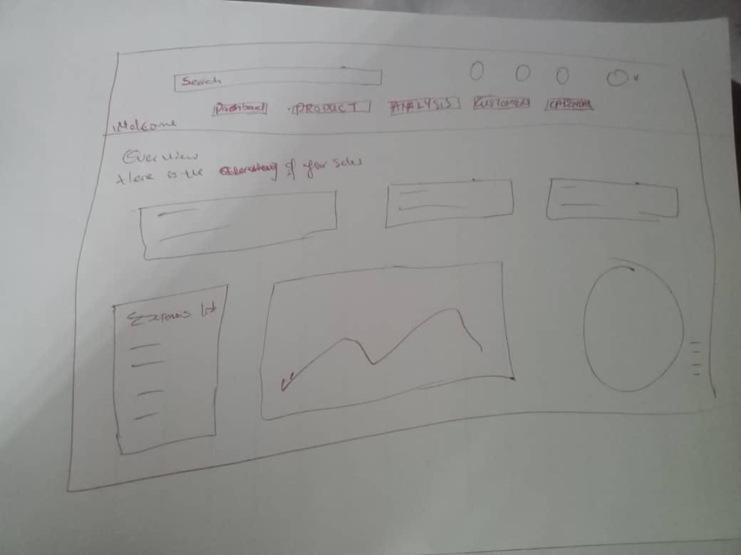
Sketch
I went ahead and sketched out the kind of design I had in mind.
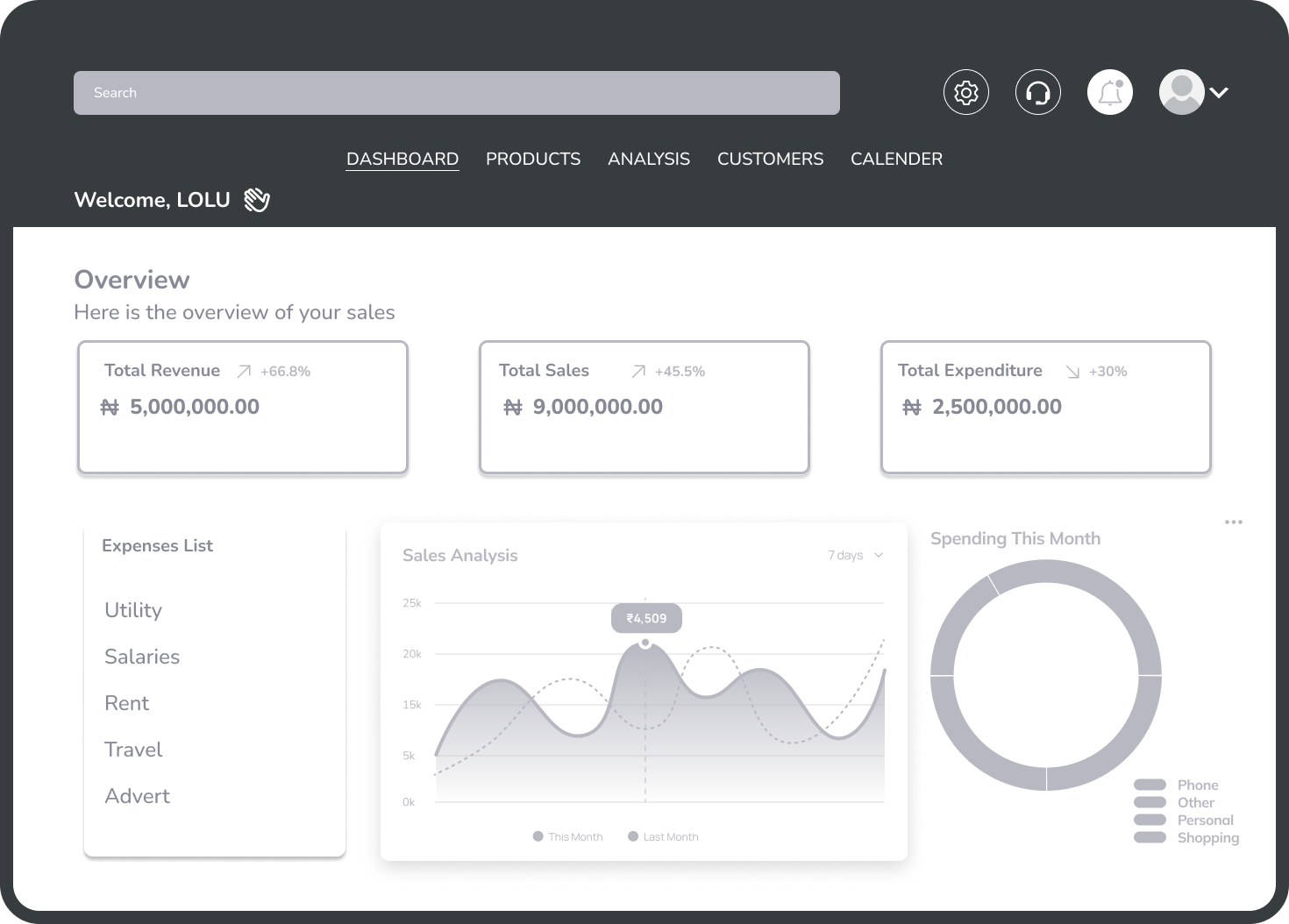
Mid-Fidelity Wireframe
I designed the mid-fidelity wireframe to set a foundation for the high-fidelity design.
Design
Conclusion
I just wanted to try out something new and see how it will look. What do you think about this new layout, do you think it is optimal?